library(DBI)
library(dplyr)
library(tidyverse)
library(DT)
library(patchwork)
library(extrafont)
sleep_default <- 3
source("../theme/theme_ts.R")In this post, I will practice a few examples of time series analysis inspired by the book SQL for Data Analysis: Advanced Techniques for Transforming Data into Insights using Retail and Food Services Sales data from this source. The data source, Monthly Retail Trade Report: Retail and Food Services Sales, includes monthly total sales and sales for different subcategories of retail sales from 1992 to 2020. It is an Excel file that I chose to import into PostgreSQL and use SQL to retrieve the data.
The purpose of these examples is to practice analyzing time series data. The data will be analyzed in SQL and graphed in R to visualize trends by month and year. First, I will look at the total monthly retail and food services sales, then I will compare the sales of two subcategories from the dataset: sales at new car dealers and sales at used car dealers, across the same time range.
Prerequisites
Load the R packages I need.
Connect to the database
I will use R to connect to the PostgreSQL database to access and query the data.
con <- DBI::dbConnect(RPostgres::Postgres(),
                      dbname = 'training_center',
                 host = 'localhost',
                 port = 5432,
                 user = Sys.getenv("DEFAULT_POSTGRES_USER_NAME"),
                 password = Sys.getenv("DEFAULT_POSTGRES_PASSWORD"),
                 bigint = "integer") # change integer64 to integer
The fields used from the dataset for analysis are:
sales_month(month and year)kind_of_business(details of subcategories of retail sales)sales(sales figures in millions of US dollars).
The data spans from January 1992 to December 2020.
Subcategories of retail sales
rs_subcategories <- "
SELECT DISTINCT
    rs.kind_of_business
FROM training_data.retail_sales rs
ORDER BY rs.kind_of_business ;
"
rs_subcategories_tbl <- (dbGetQuery(con, rs_subcategories))
Subcategories of retail sales dataset
Total retail and food services in US
I will start by looking at total monthly retail and food services sales.
Monthly Retail and Food Services in US
monthly_rfs_sales <- "
SELECT
    rs.sales_month ,
    rs.sales
FROM training_data.retail_sales rs
WHERE upper(rs.kind_of_business) = upper('retail and food services sales, total');
"
monthly_rfs_sales_tbl <- (dbGetQuery(con, monthly_rfs_sales))
Code
(monthly_rfs_sales_plot <- ggplot(monthly_rfs_sales_tbl, aes(x = sales_month, y = sales))+
  geom_line(color = "#222222", linewidth = 1)+
  geom_hline(yintercept = 0, linewidth = 1, colour="#333333")+
  scale_y_continuous(labels = scales::dollar_format())+
  scale_x_date(date_breaks = '5 years',
               labels = scales::date_format("%Y"))+
  labs(
    title = 'Monthly Retail and Food Services Sales in US',
    subtitle = '1992 to 2020',
    x = '',
    y = '$MM Sales'
  )+
  theme_ts()+
    theme(
      panel.grid.minor = element_line(),
      axis.title.y = element_text(hjust = 0.5, size = 18,
                                  margin = margin(0, 6, 0, 15, "pt")))
)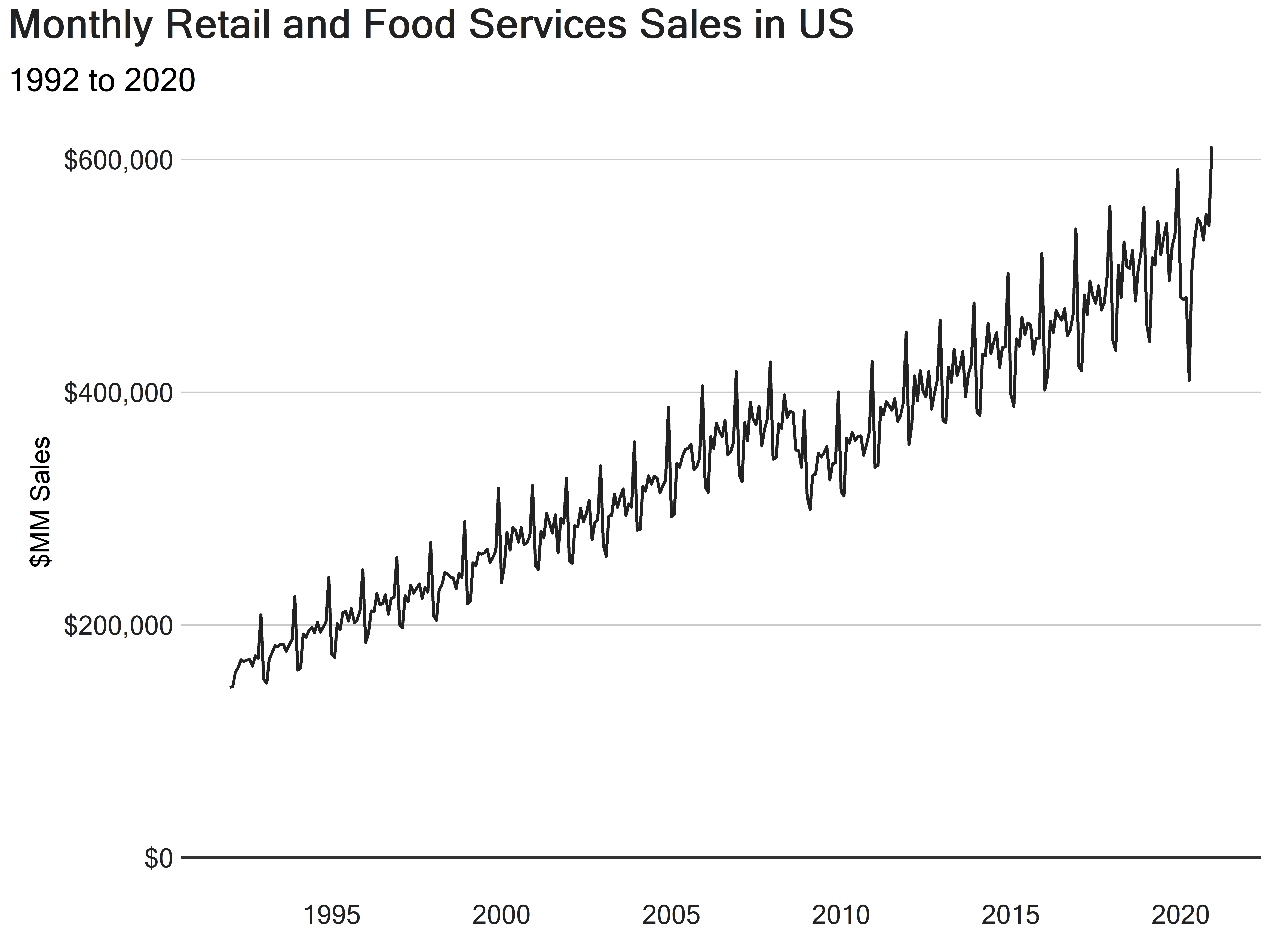
The trend shows an increase, with two periods of decreasing sales. However, it is not so clear at monthly level. We can aggregate the data from monthly to yearly to make the results easier to understand.
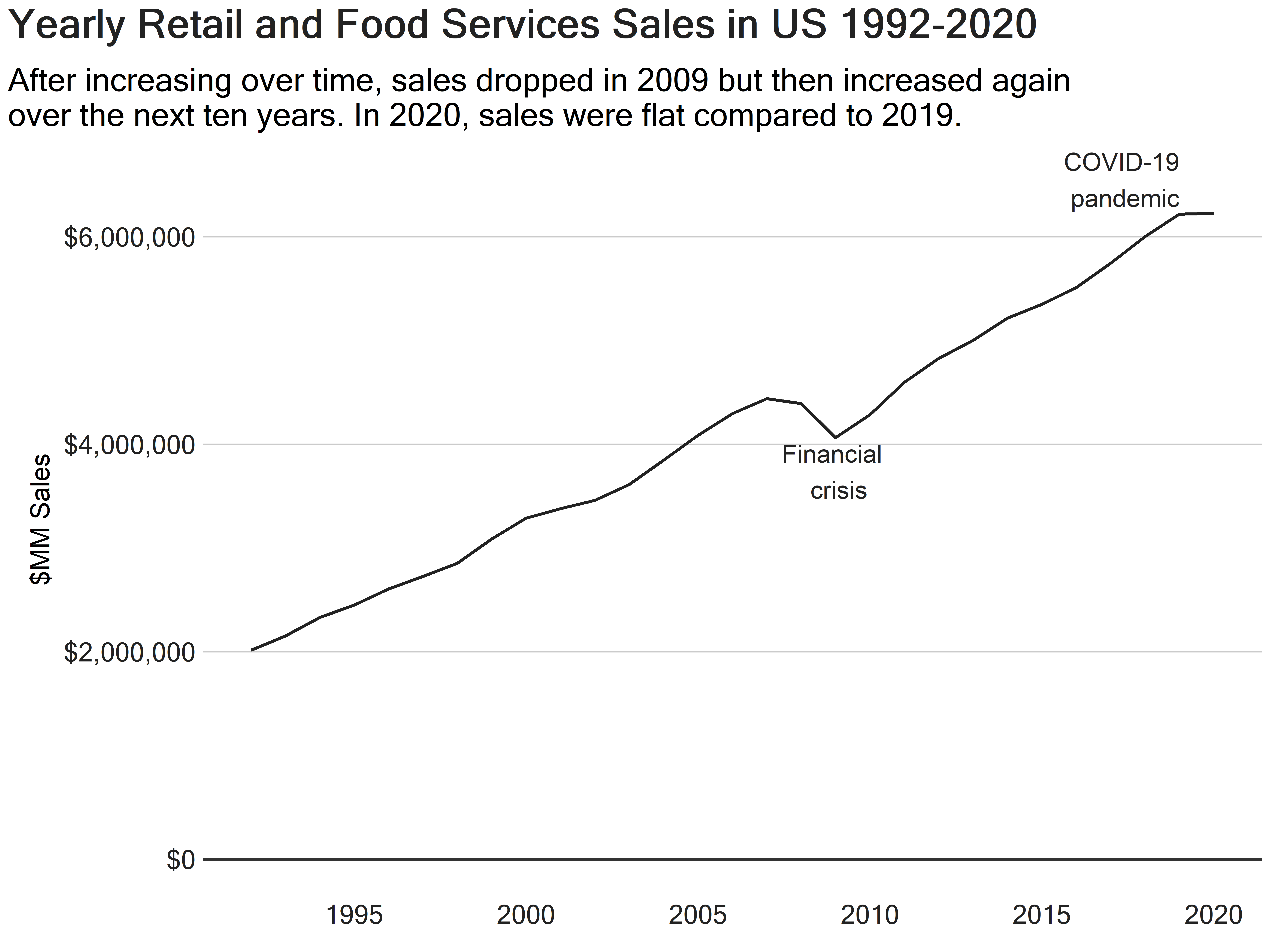
How do the retail and food services sales look by year?
yearly_rfs_sales <- "
SELECT
    date_part('year', rs.sales_month) AS year,
    sum(rs.sales) AS sales
FROM training_data.retail_sales rs
WHERE upper(rs.kind_of_business) = upper('retail and food services sales, total')
GROUP BY date_part('year', rs.sales_month);
"
yearly_rfs_sales_tbl <- (dbGetQuery(con, yearly_rfs_sales))
Yearly Retail and Food Services Sales
Code
yearly_rfs_sales_tbl <- yearly_rfs_sales_tbl |>
  mutate(year = as.Date(paste0(year, "-01-01")))

(yearly_rfs_sales_plot <- ggplot(yearly_rfs_sales_tbl, aes(x = year, y = sales))+
  geom_line(color = "#222222", linewidth = 1)+
  geom_hline(yintercept = 0, linewidth = 1, colour="#333333")+
  scale_y_continuous(labels = scales::dollar_format())+
  scale_x_date(date_breaks = '5 years',
               labels = scales::date_format("%Y"))+
  labs(
    title = 'Yearly Retail and Food Services Sales in US 1992-2020',
    subtitle = 'After increasing over time, sales dropped in 2009 but then increased again  \nover the next ten years. In 2020, sales were flat compared to 2019.',
    x = '',
    y = '$MM Sales'
  )+
    theme_ts()+
    theme(
      panel.grid.minor = element_line(),
      axis.title.y = element_text(hjust = 0.5, size = 18,
                                  margin = margin(0, 6, 0, 15, "pt"))
    )+
    annotate(
      "text",
      x = as.Date(c("2009-01-01", "2019-01-01")),
      y = c(4000000, 6550000),
      label = c("Financial \n crisis", "COVID-19\npandemic"),
      vjust = c(1, 0.5),
      hjust = c(0.5, 1),
      colour = "#222222",
      size = 6
    )
  )
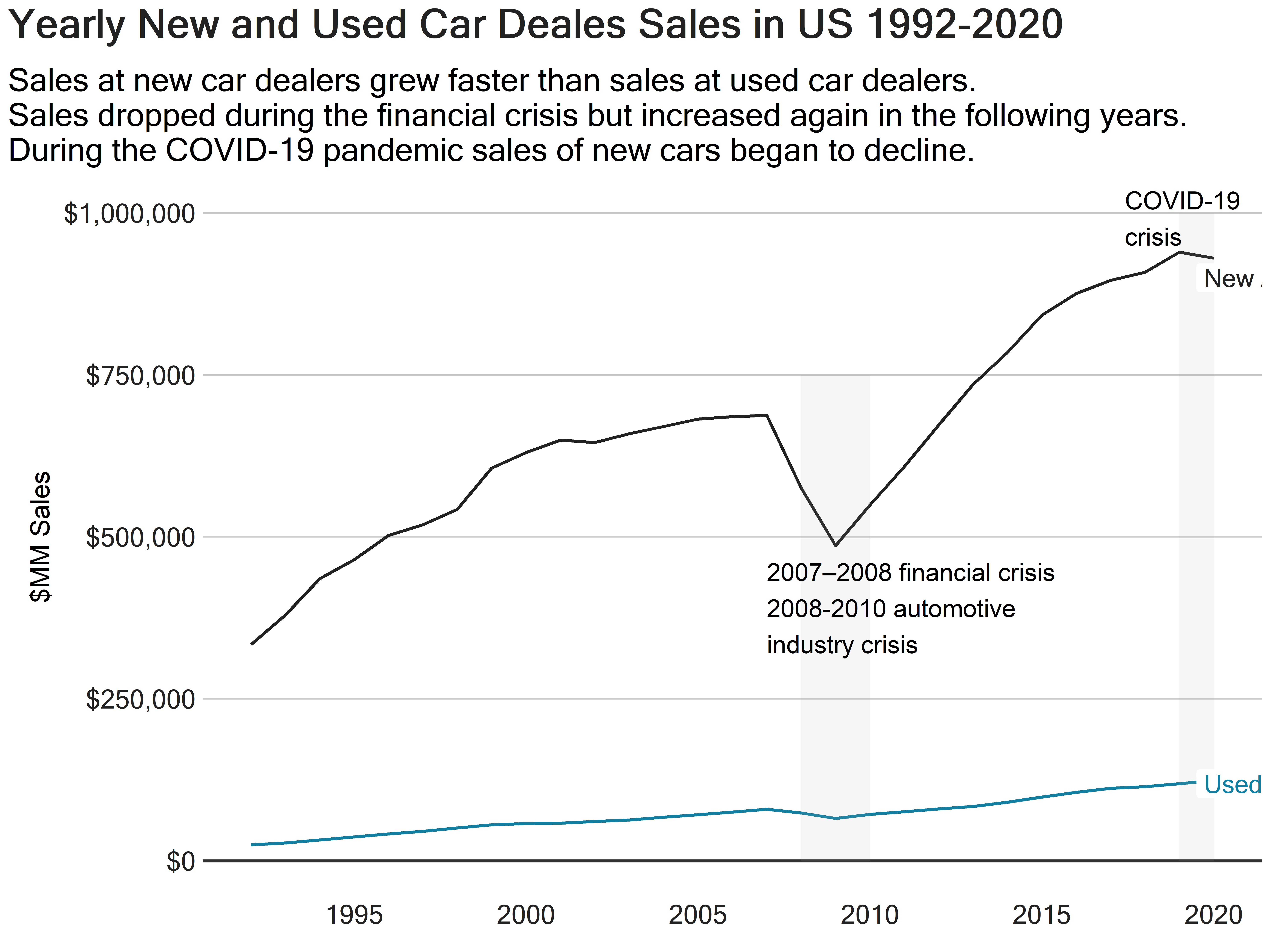
For the next examples, I will look at sales at new and used car dealers, two of the subcategories included in the retail sales dataset.
Comparing yearly sales of new car dealers with used car dealers
new_used_car_sales <- "
SELECT
    EXTRACT(YEAR FROM rs.sales_month) AS year,
    rs.kind_of_business,
    sum(rs.sales) as sales
FROM training_data.retail_sales rs
WHERE upper(rs.kind_of_business) = upper('new car dealers') OR
      upper(rs.kind_of_business) = upper('used car dealers')
GROUP BY EXTRACT(YEAR FROM rs.sales_month), rs.kind_of_business
ORDER BY year;
"
new_used_car_sales_tbl <- (dbGetQuery(con, new_used_car_sales))
New and Used Car Yearly Sales
Code
new_used_car_sales_tbl <- new_used_car_sales_tbl |>
  mutate(year = as.Date(paste0(year, "-01-01")))

new_used_car_sales_tbl_plot <- ggplot(new_used_car_sales_tbl, aes(x = year, y = sales, color = kind_of_business))+
  geom_line(linewidth = 1)+
  geom_hline(yintercept = 0, linewidth = 1, colour="#333333")+
  scale_y_continuous(labels = scales::dollar_format())+
  scale_x_date(date_breaks = "5 years",
               label= scales::date_format("%Y"))+
  scale_color_manual(values = c('New car dealers' = "#222222", 'Used car dealers' = "#1380A1" ))+
  labs(
    title = 'Yearly New and Used Car Deales Sales in US 1992-2020',
    subtitle = 'Sales at new car dealers grew faster than sales at used car dealers. \nSales dropped during the financial crisis but increased again in the following years. \nDuring the COVID-19 pandemic sales of new cars began to decline.',
    x = '',
    y = '$MM Sales',
  )+
  theme_ts()+
  theme(
      panel.grid.minor = element_line(),
      axis.title.y = element_text(hjust = 0.5, size = 18,
                                  margin = margin(0, 6, 0, 15, "pt")),
      legend.position = "none")+
  annotate(
    'rect',
    xmin = as.Date(c("2008-01-01", "2019-01-01")),
    xmax = as.Date(c("2010-01-01", "2020-01-01")),
    ymin = c(0, 0),
    ymax = c(750000,1000000),
    fill = '#A6A6A5',
    alpha = 0.1
  )+
  annotate(
    'text',
    x = as.Date(c("2007-01-01", "2017-06-01")),
    y = c(460000, 950000),
    label = c("2007–2008 financial crisis \n2008-2010 automotive \nindustry crisis",
                "COVID-19 \ncrisis"),
    size = 6,
    hjust = 0,
    vjust = c(1, 0)
    )


 (new_used_car_sales_tbl_plot <- new_used_car_sales_tbl_plot +
    geom_label(aes(x = as.Date("2019-07-01"), y = 900000, label = "New /ncar"),
                hjust = 0,
                vjust = 0.5,
                colour = "#222222",
                fill = "white",
                label.size = NA,
                family="Microsoft Sans Serif",
                size = 6) +
    geom_label(aes(x = as.Date("2019-07-01"), y = 119000, label = "Used /ncar"),
                hjust = 0,
                vjust = 0.5,
                colour = "#1380A1",
                fill = "white",
                label.size = NA,
                family="Microsoft Sans Serif",
                size = 6)
 )
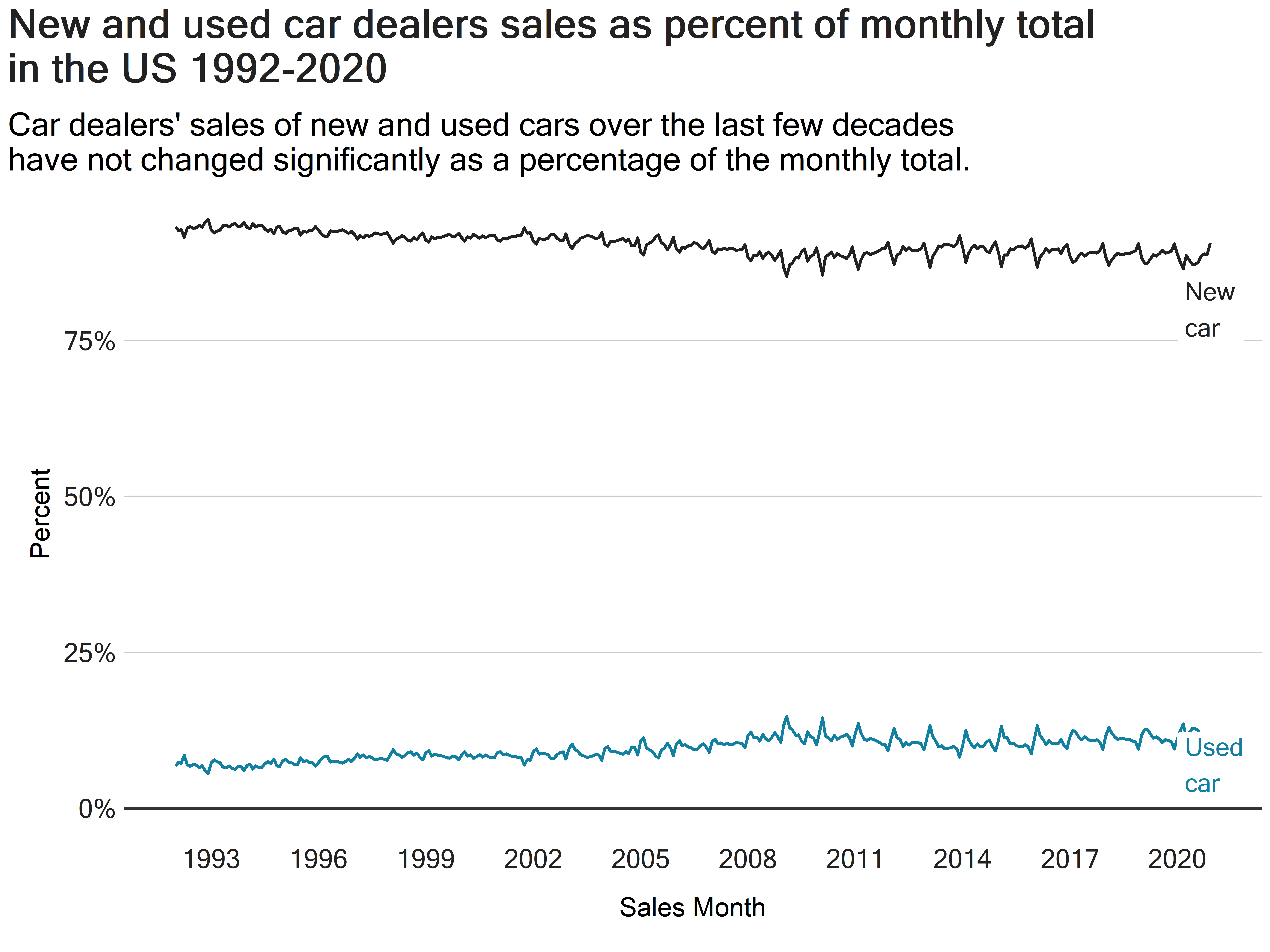
As we saw, new car sales are considerably higher than used car sales, but what exactly are the values of new and used car dealers’ sales as a percent of total monthly sales?
new_and_used_car_sales_percent <- "
SELECT
    rs.sales_month,
    rs.kind_of_business,
    sum(rs.sales) AS category_sales,
    sum(sum(rs.sales)) OVER (PARTITION BY rs.sales_month) AS total_sales,
    round(sum(rs.sales) / sum(sum(rs.sales)) OVER (PARTITION BY rs.sales_month) * 100, 2) AS category_percent
FROM training_data.retail_sales rs
WHERE rs.kind_of_business IN ('New car dealers', 'Used car dealers')
GROUP BY rs.sales_month, rs.kind_of_business
ORDER BY rs.sales_month;;
"
new_and_used_car_sales_percent_tbl <- (dbGetQuery(con, new_and_used_car_sales_percent))
Code
new_and_used_car_sales_percent_plot <- ggplot(new_and_used_car_sales_percent_tbl, aes(x = sales_month, y = category_percent, color = kind_of_business ))+
  geom_line(linewidth = 1)+
  geom_hline(yintercept = 0, linewidth = 1, colour="#333333")+
  scale_x_date(date_breaks = "3 years",
               labels = scales::date_format("%Y"))+
  scale_y_continuous(labels = scales::percent_format(scale = 1),
                     breaks = seq(0,100,25))+
  scale_color_manual(values = c('New car dealers' = "#222222", 'Used car dealers' = "#1380A1"))+
  labs(
    title = 'New and used car dealers sales as percent of monthly total \nin the US 1992-2020',
    subtitle = "Car dealers' sales of new and used cars over the last few decades \nhave not changed significantly as a percentage of the monthly total.",
    x = 'Sales Month',
    y = 'Percent'
  )+
  theme_ts()+
  theme(
      panel.grid.minor = element_line(),
      axis.title.y = element_text(hjust = 0.5, size = 18,
                                  margin = margin(0, 6, 0, 15, "pt")),
      axis.title.x = element_text(hjust = 0.5,  size = 18,
                                  margin = margin(6, 0, 15, 0, "pt")),
      legend.position = "none")

 (new_and_used_car_sales_percent_plot <- new_and_used_car_sales_percent_plot +
    geom_label(aes(x = as.Date("2020-01-01"), y = 80, label = "New \ncar"),
                hjust = 0,
                vjust = 0.5,
                colour = "#222222",
                fill = "white",
                label.size = NA,
                family="Microsoft Sans Serif",
                size = 6) +
    geom_label(aes(x = as.Date("2020-01-01"), y = 7, label = "Used \ncar"),
                hjust = 0,
                vjust = 0.5,
                colour = "#1380A1",
                fill = "white",
                label.size = NA,
                family="Microsoft Sans Serif",
                size = 6)
 )
During the past few decades, how have sales of new and used cars dealers varied in dollars and percent?
gap_percent_sales_cars <- "
WITH car_sales AS
    (SELECT
        EXTRACT (YEAR FROM rs.sales_month) AS year,
        sum(CASE WHEN upper(rs.kind_of_business) = upper('New car dealers') THEN rs.sales END) AS new_car_sales,
        sum(CASE WHEN upper(rs.kind_of_business) = upper('Used car dealers') THEN rs.sales END) AS used_car_sales
    FROM training_data.retail_sales rs
    GROUP BY EXTRACT (YEAR FROM rs.sales_month)
    ORDER BY year)
SELECT
    cs.year,
    cs.new_car_sales,
    cs.used_car_sales,
    (cs.new_car_sales - cs.used_car_sales) AS delta,
    round((cs.new_car_sales / cs.used_car_sales), 2) AS ratio,
    round(((cs.new_car_sales / cs.used_car_sales) -1)*100, 2) AS percent
FROM car_sales cs;
"
gap_percent_sales_cars_tbl <- (dbGetQuery(con, gap_percent_sales_cars))
Code
gap_percent_sales_cars_tbl <- gap_percent_sales_cars_tbl|>
mutate(year = as.Date(paste0(year, "-01-01")))
gap_sales_cars_tbl_plot <- ggplot(gap_percent_sales_cars_tbl, aes(x = year, y = delta))+
geom_line(linewidth = 1, color = "#222222")+
geom_hline(yintercept = 0, linewidth = 1, colour="#333333")+
scale_x_date(date_breaks = '5 years',
labels = scales::date_format('%Y'))+
scale_y_continuous(labels = scales::dollar_format())+
labs(
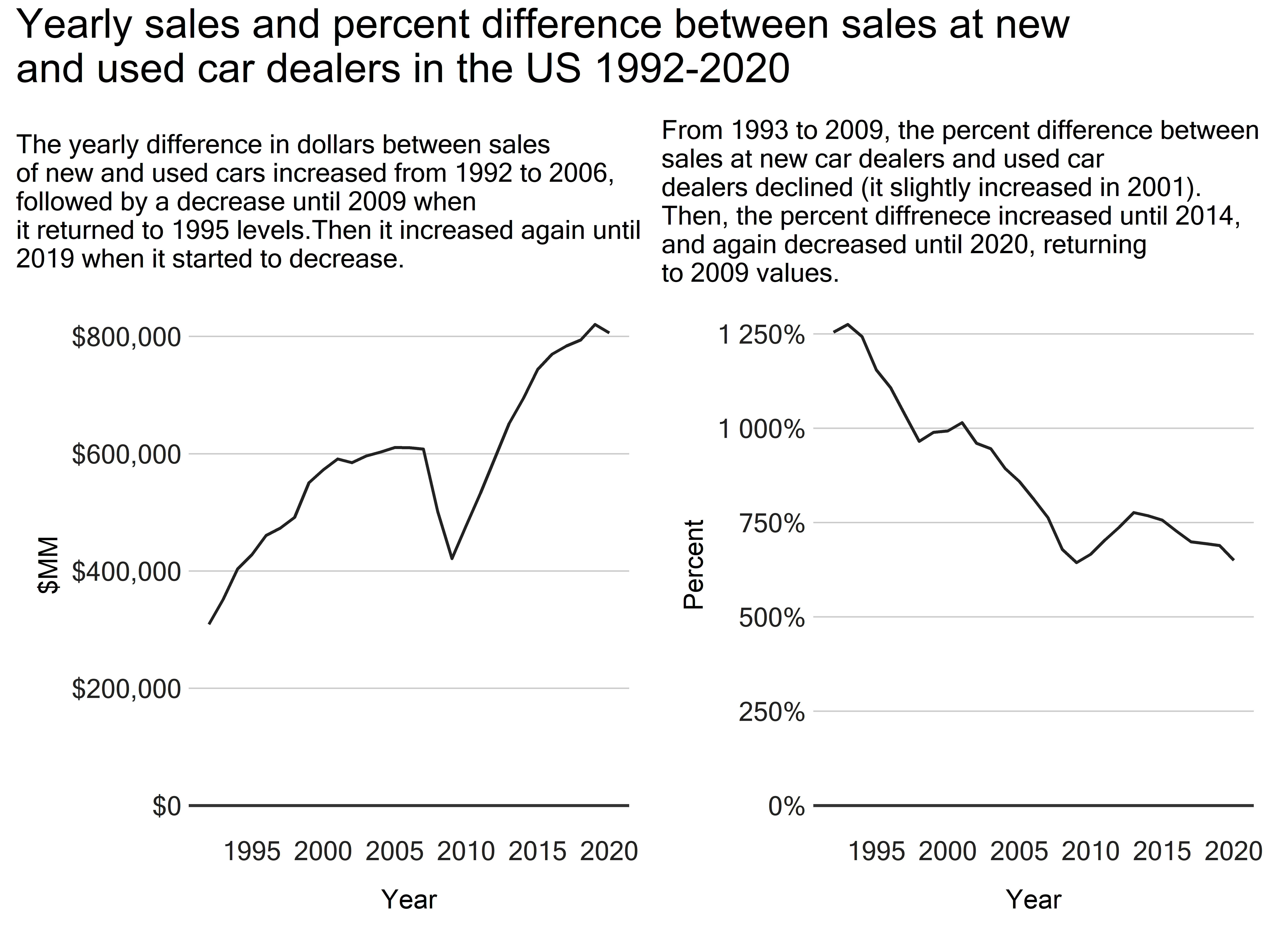
subtitle = 'The yearly difference in dollars between sales \nof new and used cars increased from 1992 to 2006, \nfollowed by a decrease until 2009 when \nit returned to 1995 levels.Then it increased again until \n2019 when it started to decrease.',
x = 'Year',
y = '$MM'
)+
theme_ts()+
theme(
panel.grid.minor = element_line(),
axis.title.y = element_text(hjust = 0.5, size = 18,
margin = margin(0, 6, 0, 15, "pt")),
axis.title.x = element_text(hjust = 0.5, size = 18,
margin = margin(6, 0, 15, 0, "pt")),
plot.subtitle = element_text(size = 18))
percent_sales_cars_tbl_plot <- ggplot(gap_percent_sales_cars_tbl, aes(x = year, y = percent))+
geom_line(linewidth = 1, color = "#222222")+
geom_hline(yintercept = 0, linewidth = 1, colour="#333333")+
scale_x_date(date_breaks = '5 years',
labels = scales::date_format('%Y'))+
scale_y_continuous(labels = scales::percent_format(scale = 1),
breaks = seq(0, 1300, 250))+
labs(
subtitle = 'From 1993 to 2009, the percent difference between \nsales at new car dealers and used car \ndealers declined (it slightly increased in 2001). \nThen, the percent diffrenece increased until 2014, \nand again decreased until 2020, returning \nto 2009 values.',
x = 'Year',
y = 'Percent'
)+
theme_ts()+
theme(
panel.grid.minor = element_line(),
axis.title.y = element_text(hjust = 0.5, size = 18,
margin = margin(0, 6, 0, 15, "pt")),
axis.title.x = element_text(hjust = 0.5, size = 18,
margin = margin(6, 0, 15, 0, "pt")),
plot.subtitle = element_text(size = 18))
(combine_plot <- gap_sales_cars_tbl_plot +
plot_spacer() +
percent_sales_cars_tbl_plot +
plot_layout(widths = c(8, -0.0005, 8)) +
plot_annotation(
title = 'Yearly sales and percent difference between sales at new \nand used car dealers in the US 1992-2020') &
theme(plot.title = element_text(size = 28))
)
Conclusion
In the above examples, I practiced simple techniques to trend time series data, including aggregating data from monthly to yearly to make the results easier to understand, comparing components, and using percent of the total to compare parts to the whole. Time series analysis is a powerful way to analyze data. In the next post, I will practice and share more methods for smoothing time series data.